Where to Place Wall Art for Proper Proportion
Where to place wall art is one of the most common questions homeowners ask when a room feels incomplete. The furniture may be well chosen, the colors balanced, and the layout functional, yet the walls still feel awkwardly empty or visually unbalanced.
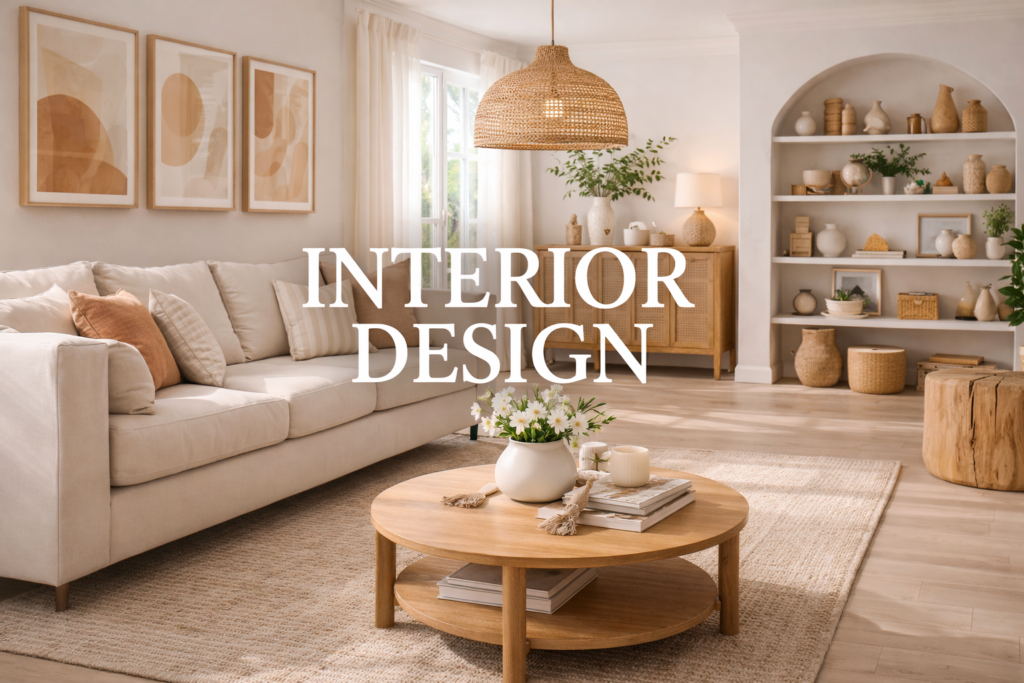
Artwork plays an important role in interior design because it connects vertical space with the furniture below it. When art placement is wrong, the room can feel disjointed. Paintings hung too high look disconnected from the space. Pieces hung too low can feel cramped and heavy.
Correct placement is not about decoration alone. It is about proportion, alignment, and visual hierarchy.
In this guide, we will break down where to place wall art so that it strengthens the structure of a room rather than competing with it.
The Eye-Level Rule for Wall Art
The most reliable rule for artwork placement is the eye-level principle.
The center of a piece of art should typically sit about 57 to 60 inches from the floor. This range reflects average standing eye level and is widely used in galleries and museums.
This measurement creates natural visual balance because the artwork aligns with how people naturally view the room.
However, this rule changes slightly when art is placed above furniture.
Artwork Above Furniture
When placing art above sofas, consoles, or beds, the artwork should relate directly to the furniture below it.
A common guideline is to position the bottom edge of the artwork about 6 to 10 inches above the furniture.
This distance visually connects the two elements so they read as a single composition rather than separate pieces.
If the gap becomes too large, the art appears to float awkwardly.
The size of the artwork also matters. A very small piece above a large sofa often looks disproportionate. This issue is closely related to Furniture Scale and Proportion: The Real-Home Rules That Prevent Regret, where the relationship between objects determines visual balance.
Matching Artwork Width to Furniture Width
Artwork should generally span two-thirds to three-quarters of the width of the furniture beneath it.
For example:
• A 90-inch sofa pairs well with artwork around 60 to 70 inches wide
• A 60-inch console works well with art around 40 inches wide
This proportion prevents both extremes:
Art that is too small looks lost.
Art that is too large overwhelms the furniture.
Proportion, not decoration, determines harmony.
Gallery Walls and Spacing
Gallery walls introduce a different challenge.
Instead of a single focal piece, multiple frames create a visual composition.
Spacing between frames should usually fall between 2 and 4 inches.
Consistent spacing is more important than perfect symmetry. When spacing varies randomly, the arrangement feels chaotic.
Before hanging anything permanently, it helps to lay out frames on the floor to test composition.
This process aligns with planning methods discussed in How to Design a Room Layout That Feels Natural and Functional, where testing layout before committing prevents long-term frustration.
Avoid Hanging Art Too High
One of the most common mistakes is hanging art too high on the wall.
This usually happens when people try to center artwork vertically on a large wall. The result is a disconnect between furniture and wall decor.
Rooms feel more grounded when artwork visually anchors the furniture area rather than floating in unused space above it.
Lower placement often improves cohesion immediately.
Choosing the Right Size Artwork
Wall art should match the scale of the room.
Large open walls require larger artwork or grouped pieces to maintain balance.
Small artwork on expansive walls creates visual emptiness around it.
Similarly, oversized art in a compact room may feel overwhelming.
Balancing wall art size with furniture layout helps avoid the kind of visual crowding described in Why Does My Living Room Feel Crowded Even When It’s Clean, where competing focal points compress the room visually.
Aligning Artwork With Architectural Lines
Whenever possible, artwork should align with architectural elements.
This may include:
• window tops
• door frames
• shelving lines
• furniture edges
Alignment creates structure and order.
When artwork ignores these lines, the room can feel subtly chaotic even if the pieces themselves are beautiful.
Interior design often works best when elements reinforce the architecture of the space.
When Large Art Works Best
In many rooms, a single large artwork can create stronger impact than several smaller pieces.
Large art simplifies the visual hierarchy and provides a clear focal point.
This approach works especially well in living rooms, dining rooms, and entryways where strong focal points help guide the eye.
Multiple small pieces can still work, but they require careful composition.
Testing Placement Before Hanging
Before drilling into the wall:
- Hold the artwork in position
- Step back across the room
- Evaluate the relationship with furniture
- Check alignment with surrounding elements
Small adjustments can significantly change how balanced the room feels.
Taking time to test placement often prevents unnecessary wall repairs later.
FAQ
What height should wall art be hung?
The center of artwork is typically placed around 57 to 60 inches from the floor.
How far above furniture should art hang?
Usually about 6 to 10 inches above the furniture to maintain visual connection.
How wide should artwork be above a sofa?
Ideally two-thirds to three-quarters of the sofa width.
Should art be centered on the wall or the furniture?
In most cases it should be centered relative to the furniture below it.
Is one large artwork better than multiple small ones?
Often yes, because it creates a clear focal point and simplifies visual balance.
Conclusion
Understanding where to place wall art helps transform empty walls into structured parts of the room. Proper height, spacing, and proportion allow artwork to support furniture layout and strengthen the overall design.
When art aligns with furniture scale and architectural lines, the room feels more intentional, balanced, and complete without adding unnecessary decoration.